Learn how to create this photo manipulation with this detailed step-by-step walkthrough. You'll learn how to combine a beautiful redhead model with a black raven in a mystical landscape scene.
Preview of Final Results
Download the PSD
Into the Wild.zip | 4.4 MB
Download from Website
Into the Wild Photoshop Tutorial
Tutorial Resources
- Foggy Forest – Malleni-Stock
- Redhead model – FaestockForest I – Malleni-stock
- Forest II – 10Ravens
- Lower Ground – Compot-stock
- Raven – Tasastock
Step 1
Create a new file by going to File > New and choosing the settings shown. I ended up cropping the final result a little bit, but A4 is always a nice size to start out with.
Step 2
Open the foggy forest, select all (Ctrl + A), copy it (Ctrl + C) and place it (Ctrl + V) on a new layer. Darken in Image > Adjustments > Hue/Saturation. I didn’t resize it because I liked how the trees were positioned.
Step 3
Now place the other forest on top of it and resize it to fit by hitting Ctrl + T and then dragging from the corners until the size fits your original canvas. You must drag from the corners – if you don’t, your image will look stretched and ugly.
Step 4
Set the layer mode to Multiply. The bottom part of the second forest will show up strange – it will be fixed later. Leave it as is.
Go to Image > Adjustments > Curves set the Output around 140-180 and Input to 50-90, then move the Vibrance slider to -40. Then go to Color Balance and make Shadows, Midtones and Highlights more blue, +9 should be enough for all three.
Step 5
Zoom in to 100%, select Blur tool, Size 300 soft round, Strength 50% and blur the treetops on the second forest layer. Just click around.
Step 6
Grab the Magic Wand tool, set Tolerance to 50 and make sure the Contiguous box is unticked. Then hit Shift + F6 and a box pops up: set the feather to 5, click ok. Now use the eraser tool, soft round size 300 and opacity between 10-25% and erase some of the treetops to blend them better.
Step 7
Now select the bottom part with the marquee tool (shortcut M), right-click and choose “Layer via Copy” and blend it in by darkening it with Gamma Correction (Image > Adjustments > Exposure), then adding some blue colour and reducing Vibrance by 50 (Image > Adjustments > Vibrance). Also add a Blur Filter (Filter > Blur > Blur). Then blend it in with a soft round eraser on low opacity (10-30%) and I also darkened the sides with the Burn tool on low opacity. Again, this is mostly just clicking around and seeing what works the best. You can see from the .psd file how I blended it, too.
Step 8
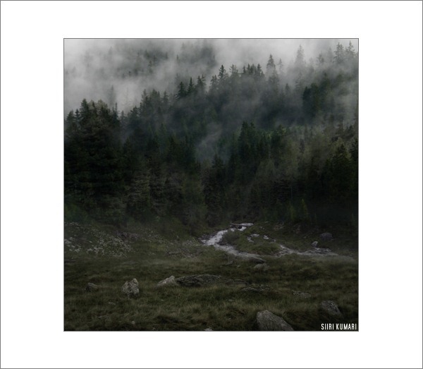
You should see a similar result. I allow myself to have some slight colouring mistakes since in the end I’m going to apply an additional colour which will make everything better
Step 9
Copy and paste the bottom ground photo. Select the upper part with the Marquee Tool, set Feather to 150 and hit Delete twice.
Step 10
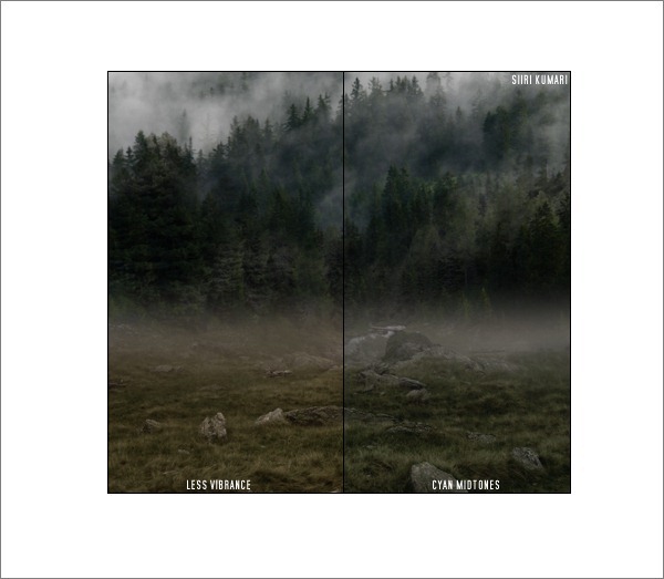
Lower Vibrance and add some Cyan midtones in Color Balance to achieve a similar result. I don’t usually write down the exact settings I use for getting nicely blended colours, but keeping in mind some colour theory is always the best. If you want something to be less yellow/orange, turn it more blue/green.
Step 11
Blend both layers with a soft round eraser as always.
Step 12
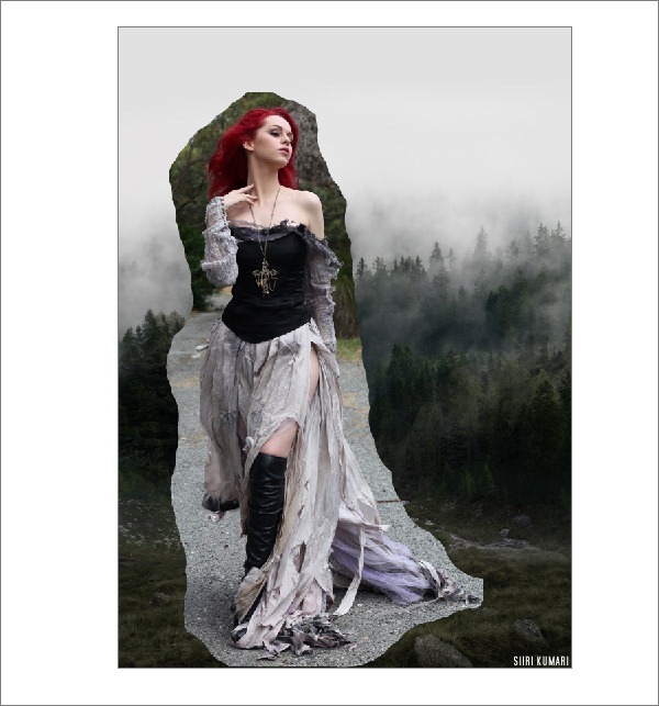
Copy and paste the model (ash 33 by faestock). I usually erase the background quite loosely so that I can see better where to fit her (optional step).
Step 13
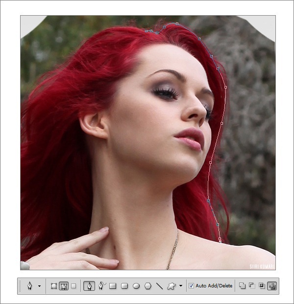
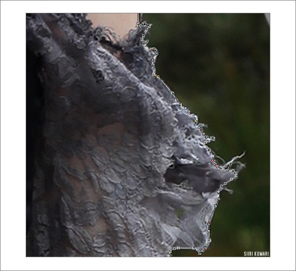
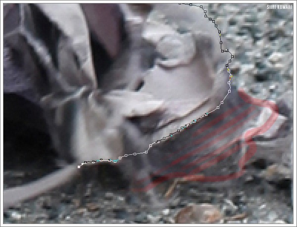
Cut out the model with the Pen Tool, using the settings shown. Sometimes you need to click and drag, and sometimes you have to do lots of little dots that are very close to each other.
This is an example of the „little dots” technique.
Sometimes I don’t cut out unimportant and blurry parts.
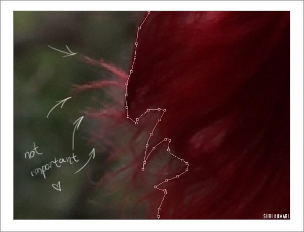
Step 14
Cut the hair like this. Loose strands are not imporant right now.
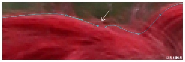
Step 15
Unite the last two dots to finish the path.
Step 16
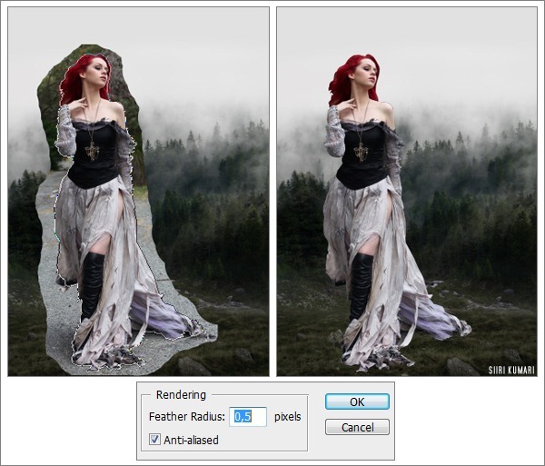
This is what it looks like before it’s about to be cut out. Right-click and make a selection, then set the Feather to 0,5px. Hit Ctrl + Shift + I to invert the selection and then Delete to get a clear background.
Step 17
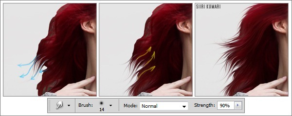
Hair can be a bit tricky. Use the Smudge tool, strength 80-90% and create loose hair strands by moving outwards and inwards in the hair area. You will probably need a graphics tablet for this, although some people can paint similar results with a mouse (I never had a tablet until September 2011). Smudge, smudge, smudge.
Step 18
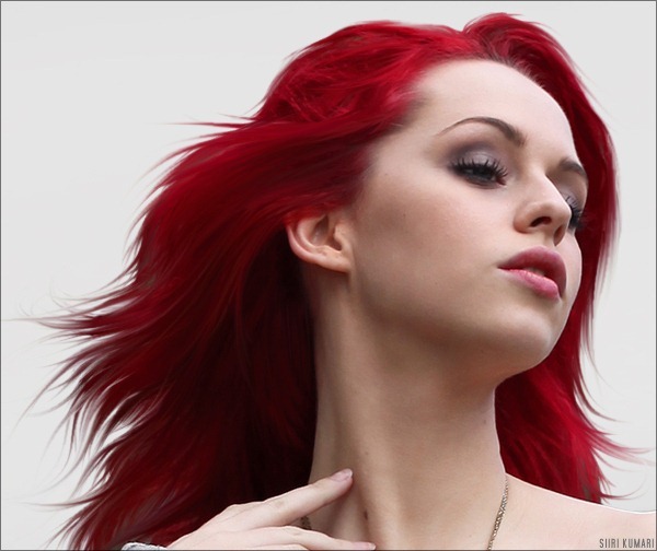
Enchance Reds in Replace colour (Image > Adjustments > Replace Color) by clicking on the hair area once and moving the saturation bar to right. I tend to keep my Fuzziness around 100 or so to get a nice, clean saturation. This is also the final hair result.
Step 19
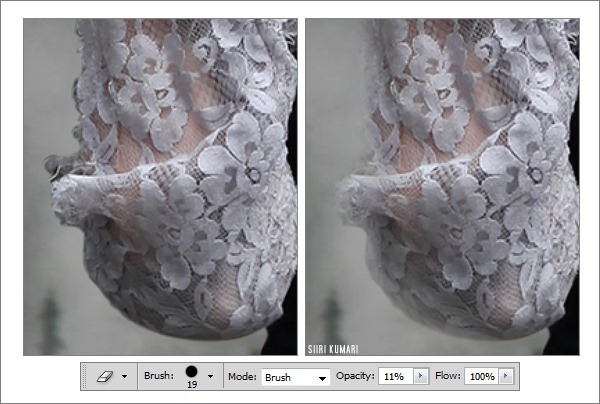
Using a hard round eraser on low opacity, softly blend in the edges of the model.
Step 20
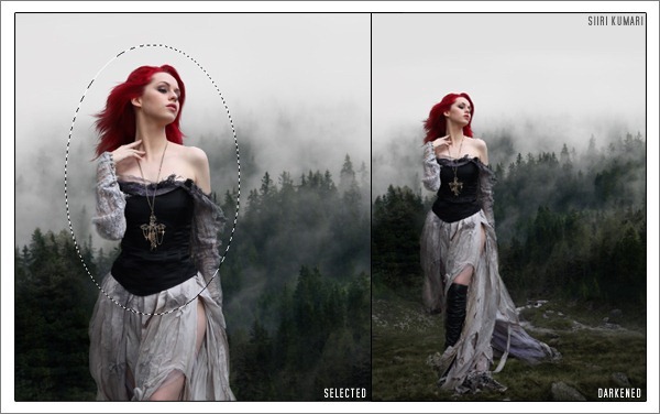
Draw an circle around the model’s upper body with the elliptical marquee tool (the elliptical marquee appears if you click and hold on the usual marquee in the toolbar) and select inverse. Right-click and set Feather to 150. Slightly darken it in Image > Adjustments > Hue/Saturation. Do some additional darkening with the Burn Tool if needed.
Step 21
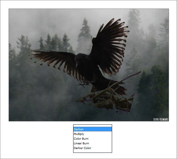
Basically, you can call the photomanipulation complete, but I’d like to add some more details. Paste the raven near the model to create a nice composition. Then set the layer mode to Darken – it will blend it pretty well.
Step 22
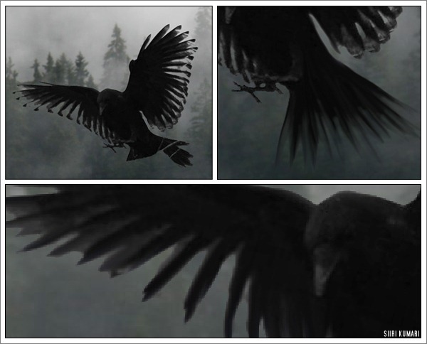
Use a hard round eraser on maximum opacity to remove the branches. Also desaturate the raven (Shift + Ctrl + U) to get rid of ugly green undertones. As you can see, half of its tail is gone, so use the Smudge tool on high strength to retrieve it. Smudge the wings as well. Sometimes a little Blur can do wonders!
Step 23
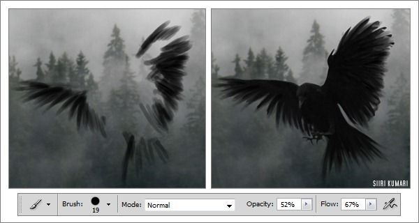
Create a new layer underneath the raven, take the brush tool and set both the opacity and flow between 40-60% and paint some more feathers to add volume to the crow. It’s not easy to explain, but I have included a separate screenshot of the shape I painted. This can be also done with a mouse, as long as you keep erasing and smudging the ends.
Step 24
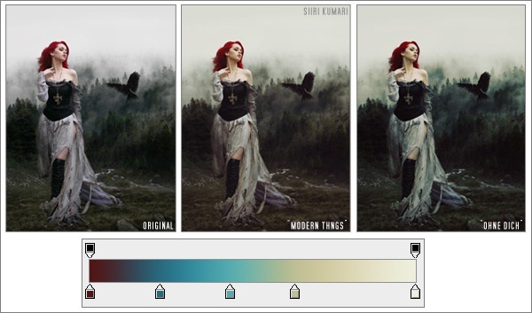
Colours… I usually flatten everything together and then I use a slightly modified version of Julia Trotti’s „modern things” curve on a new layer and set the layer’s opacity to 75%. To get a colder version, merge everything down again and duplicate the background layer, set it to Soft Light 45% opacity, then go to Gradient Maps and using something like my gradient „ohne dich” create some new colours. (I cannot share just one gradient, the whole lot comes with it, so save this image to your computer, open it in Photoshop and use the Color Picker tool to “take” the colours from these boxes)
Final Result
I decided to go with the “modern things” version.
Download the PSD
Into the Wild.zip | 4.4 MB
Download from Website


 2:14 AM
 Unknown


![Into the Wild_600px[1] Into the Wild_600px[1]](http://photoshoptutorials.ws/images/stories/f8f43a6b020b_FB21/Into-the-Wild_600px1.jpg)
0 nhận xét:
Post a Comment